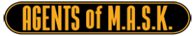


Has HASBRO Revealed M.A.S.K.'s New Logo?

M.A.S.K. has been an "emerging brand" for several years according to HASBRO. Going all the way back to an overview presentation in 2015, the traditional M.A.S.K. logo has been spotted in investor and newsroom materials on HASBRO's corporate website. In 2015, we first noticed M.A.S.K. was a "new brand" under their "emerging brands" which shot our expectations through the roof. Over the last several years, M.A.S.K. continues to receive that "emerging brand" label with fans like us waiting anxiously for our M.A.S.K. brand to finally emerge. The latest
Of course, the M.A.S.K. film franchise announcement back in April took our already high expectations through the atmosphere. Now, the first clue that the new M.A.S.K. "franchise brand in the making" might have emerged. In the April 2018 HASBRO Investor Presentation and the latest Brand Arch graphic on their corporate website has changed M.A.S.K's traditional logo to something new:


The Brand Arch image, which was updated for the recent Power Rangers acquisition, isn't that large so trying to get a closer look at the logo makes it quite pixelated. However, I did notice one thing when you blow up the Investor image (from April 2018) versus the latest Brand Arch image...


When you look at the bottom of the logo, you can begin to see "Mobile Armored Strike Kommand." It's still too small and pixelated to really get a sharp look but it's enough to see HASBRO's vision for branding the new M.A.S.K. team. The primary colors appear to be a gradient silver outlined in black with a red underline. A new stylized font is also being used.
If this is the new logo, my first impression is I hope they add a little more. I know it's early and they probably don't want to reveal any new mask or vehicle designs or concepts but i hope this is just part of the new logo that would potentially appear on toy packaging. I do like the font, but miss the red and yellow of the old logo. And of course would love to see Rhino on top and perhaps the new Spectrum mask on the bottom to mimic the traditional logo.
What are your first impressions of the new M.A.S.K. logo, color scheme, and font?
Reactions

Posted by Jason Gross


1 Comments
My thoughts on the new Logo:
ReplyDelete"M.A.S.K. - now with even more diversity. Because f*** your childhood!"
...i wonded when we will see the first "transgender" Agent.
Sad but true: M.A.S.K. is actually dead.